The fundamental idea is that less is more. More than three typefaces should be used only in special cases. Even newspapers standardly use no more than four different ones. Anyone who wants to juggle more than two typefaces needs typographic finesse. This finesse should ideally be underpinned by knowledge and understanding of the history of the form. Or you should at least have a clue as to what to look out for - with which this article could be helpful:
The choice of the base typeface
Even when looking for just a single suitable typeface, you can drown in the flood of available options. Before choosing a basic typeface, to be used for the main text, you should ask an important question: What do I want to express with the typeface? Better still: What is the typeface intended to express?
Seeing stories
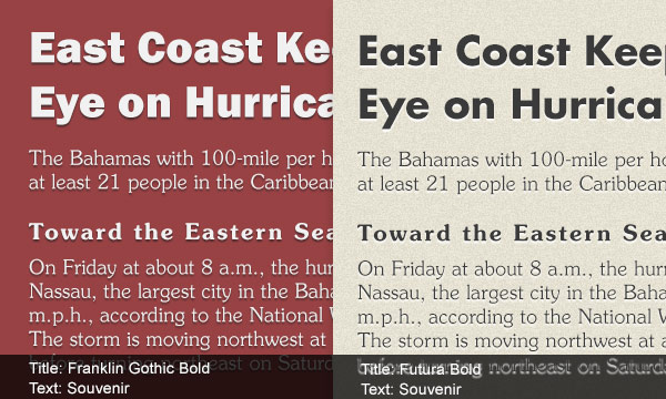
Typefaces tell stories. This is clear from the following example:

Which of these typefaces is suitable for the Wild West, which for serious objectivity and which for "Oh, how beautiful" is pretty obvious. When mixing different typefaces it is necessary to understand each typeface and look closely at the story it tells. Many typefaces stand for specific issues or social values that are easily overlooked when you have your head buried in the subject matter. So take a step back.
Recognising faces
Typefaces have faces. What face a text should have depends almost entirely on the content and targeted readers. Factual scientific texts with many diagrams are suitable for sans serif, linear typefaces. These function as captions, titles and chapter information - sometimes big, sometimes bold. Literary texts need less variety. The reader should be able to enjoy a lengthy and relaxing read. A classic serif is good for this.
Creativity and teaching
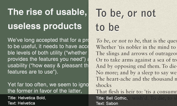
But how to find two matching typefaces? The choice of a typeface is not only governed by creative or aesthetic arguments. The teaching goal is the most basic criterion for selecting a typeface. Exactly the same applies to the typeface mix. A successful combination facilitates cross-reading, contextual sensitivities can be rapidly perceived and outlines made clear at a glance. Exactly the opposite is the effect of unsuitable combinations.
We give in what follows examples of combinations that should not encourage imitation. Rather, they are intended to provide an incentive to deal with the sensitive issue of the typeface combination. Incidentally, the little flags and markings on letters are called serifs.
Differences in weight
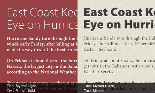
Putting everything out in the same weight class is not a good idea. Clear, distinct differences in weight help the eye to perceive differences in meaning, without any of the typefaces involved losing visual authority. This means paying attention, one the one hand, to the weights of the letters and the other to the typeface itself. Some typefaces seem light, others very heavy. Weightings direct the eye in a very targeted manner:
Different colours
The colour of a typeface does not mean the actual colour in the spectrum, but its grey value. For typeface combinations we recommend screwing up the eyes and taking a step back. This makes the text appear as a grey area, which can be lighter or darker. In the hierarchies remain clearly visible, the colour is a good choice. If everything is blurred to a pulp, the typefaces should be different.
Assigning different roles
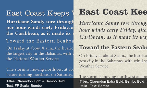
A simple way to combine different typefaces is creating a schema, which makes clearly visible what role the typeface is playing.
- Author
- Heading
- Teaser
- Subheading
- Body text
By inserting the various typefaces in the scheme it is easier to see whether they fit their role or not - each typeface in itself and in combination with the others.
Combining sans serif with serif
By far the most widespread principle in combination is to give a text with a basic serif typeface a sans serif header. This is a classic combination, and it is almost impossible to go wrong with it.
Avoid mixing moods
Typefaces have personality. There are sober, elegant and linear ones. Wrong use of the personality of an individual typeface is one thing. Worse still is to let another, contradictory one loose on it. Please avoid irritation. This also applies to classifications: typefaces with related formal origins get along better with each other than with distant relatives. But it is also possible to mix explicitly contrasting typefaces of contrasting origin.
Not just theory
Despite all theoretical considerations typeface mixing is always a question of
- 1 resources: What does it actually cost to develop a proprietary typeface?
- 2 fashion: But we do not live in the Wild West?
- 3 personal preference: Do you prefer shoes from England or Italy?
- 4 aesthetic sensibilities: It's completely beautiful, or what?
Keep it simple
Two typefaces are enough. For the reading typography the rule is: an Antiqua serif is better as the basic typeface than a font like Grotesk sans serif.

Courage to risk extremes
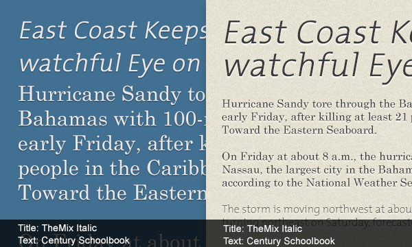
The greater the difference of typeface sizes, the less important are questions of style; with similar typeface sizes, they are particularly sensitive. If you use different highlights (bold, italic, etc.) and different typeface sizes, it helps a lot. Just practice: with the courage to change the typeface size very substantially and see what effect it has.
Reminder
This article is only a guide. There are no rules. The suggestions do not replace the trained eye of a typographer.
And because we all learn from masters, letters quote a wise saying from the people of Smashing Magazine: Creating great typeface combinations is an art, not a science. We also happily add after Willenberg and Forssmann that: Maybe that is true for combinations. But one thing is certain: Typography is a craft.
Have fun in the world of typefaces.
Votre Axel Stirn


