Every surface has a texture. That is a fact. Sand, water, walls and tables are all textured. Even the Internet has texture, or more accurately: the Internet appears to have texture. We want to explain the advantages of textures in web design and how they can be used properly !
Textures can have a variety of effects. Of course, they serve primarily the aesthetics of a web page. But they can do so much more. Here is a list of things that should be noted when building textures into a website.
A question of character
Finding the right texture is a difficult task. The target audience for the website should be addressed. A texture supports the character of the page. A logger should advertise with rustic colours, not aim for industrial minimalism.

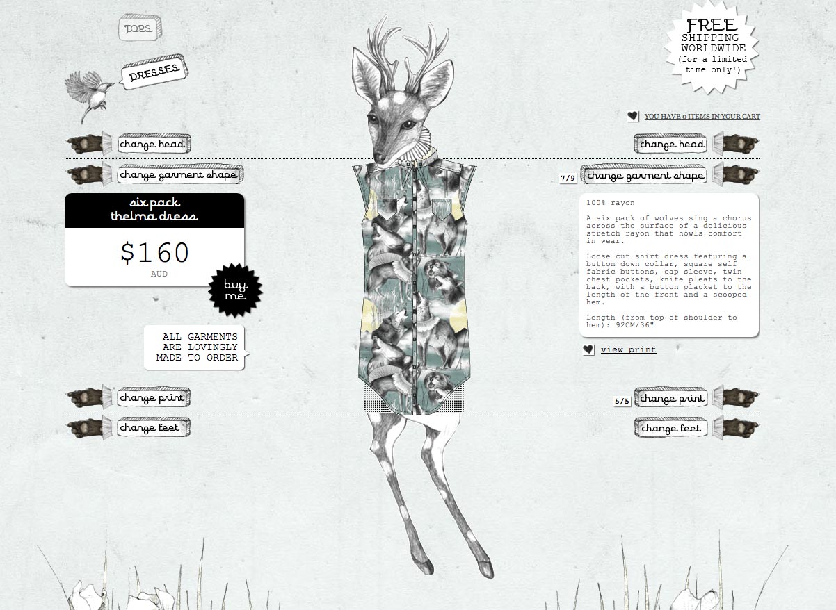
Source: http://meandoli.com/#!/6/1/2/7/6
The shop page of "meandoli" is incredibly charismatic with its carefully selected textures, without distracting from the content of the page. Prices and information are kept clean in a texture-free look.
Subdivision of the web page
The visitor's field of view can be guided by textures. Varying textures can make subdivisions.

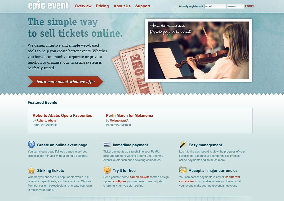
Source: https://epicevent.com.au
Epic Event succeeds very well, using various structures, in separating the header, the middle row and the contents from each other. The viewer's eye can clearly distinguish the individual elements as a result of the texture.
Beware of fonts
In fonts, textures conceal a risk of illegibility. This is a terrible offence in web design, as the copy carries the statement of a website and therefore must always be legible.

Source: http://arnbacktraining.ch/
Arnbäck-Training has decided to provide the words "Personal Training 100%" with texture. This gives the words character - it goes well with the dynamic design of the page. Arnbäck also bypasses the problem of illegibility – so this is a good example of how textures can be used in lettering.
Multiple textures must be in harmony
If multiple textures are to be implemented in a design, they must interact with one another. There should be no indiscriminate mixture. This is distracting and at worst can destroy the image of the page. It is wise to choose very carefully.

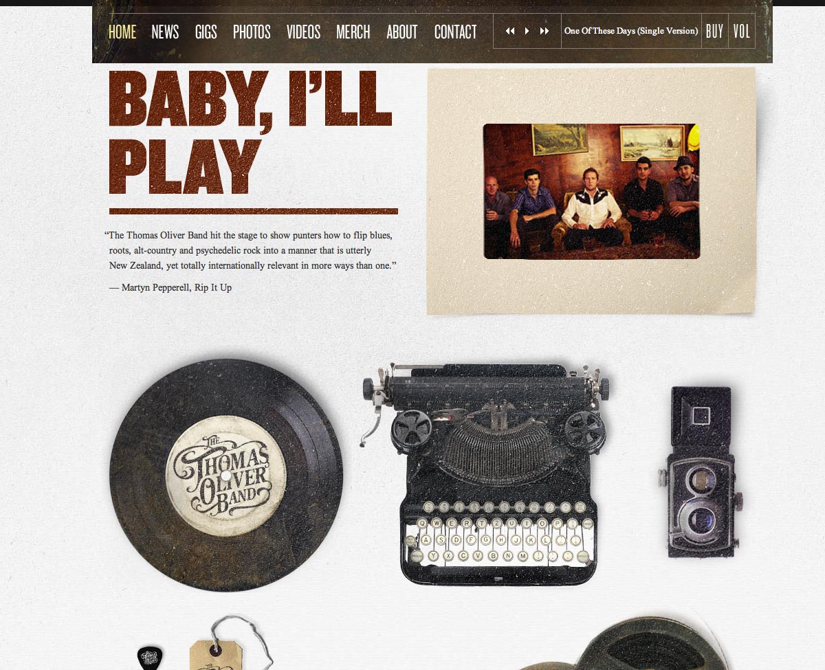
Source: http://thethomasoliverband.com/home
The boys in the Thomas Oliver Band should be more than commended for their web page. By using different textures, they create a very harmonious atmosphere that showcases the character of their band. The texture of the header, the title and the embedded video go hand in hand. Therefore, there is no overload - all fit well with the mood of the website. The font is also structured appropriately and is still readable.
Less is usually more
A texture can trigger different effects in the viewer. Particularly desirable is a "call to action". This can be achieved in two ways:
- The texture of a critical object stands out strongly against a clean background design.
- The texture nestles discreetly into the background and draws the eye to a particular feature of the page that is striking in its clean design.

Source: https://www.getyardsale.com
Yard Sale cleverly draws the attention, by a subtle background texture and the white circle, to its cleanly designed logo and the button below. The background still gives the page character, in which it would be lacking without the texture.
Conclusion
The examples illustrate very well how textures can be used properly and what effect they can have on the viewer. But they can quickly become a double-edged sword. Once a texture gets in the way of the content of the website, it has no business there any more. Textures should always be select as needed. They should not be used indiscriminately - overload destroys their aesthetic effect. When used properly, they will gives a website just the right mood.


