If we look back at the history of the Internet, we often notice that time passes extremely in Internet years. In the 90s, it was still normal to have blinking banners and cluttered websites. Such measures are now a real faux pas. Nowadays, web design should be minimalist and chic. This trend is evident in everyday life, in our operating systems and especially in web design. Today, we will explain now how minimalist web design works and give you some of the finest examples of this.
Less is more
One of the most important modernist architects, Ludwig Mies van der Rohe, coined the phrase "less is more". This also means restricting everything to the essentials. That is the direction many design trends are currently moving – in particular on the web. But not only there: Windows 8 has taken a huge step in the direction of minimalism with its tile design, ranging from desktop PCs to smartphones. However, today we will limit ourselves to discussing the web. Here it is particularly important to dispense with frills and particularly highlight the essential characteristics – as less really is more.
The most important point that a web designer needs to take note of is the focus of the website. What benefits do visitors get the site and how they can these benefits be highlighted best. There are different approaches that we want to highlight a few examples.
Typography is top of the agenda
The most important tool in conveying the message of your website remains the text. So of course the typeface is closely related. There will be certain instances in which the statement can be made through a video or image. But this is not enough or all providers. In order to make many statements, text is what is needed. One can, however, create an excellent design with text only – as our next example shows.

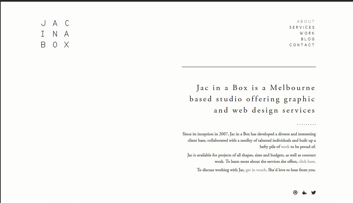
The marketing and design agency "Jac in a Box" remains minimalistic in its web design, but still packs all of the statements it needs into its website. The user will immediately understand the marketing studio’s message. The website describes their services in just a few sentences and makes it an extremely aesthetic and very minimalist impression that dispenses almost entirely with images and logos. The only exception is in the social media buttons at the bottom of the page.
Images as the main element
However, it is possible to dispense with a lot of text when the message of the website permits this. The next example shows that sites in certain areas can come straight to the point without a lot of text.

Photographer Andi Mayr has a short inscription above his images and a menu bar below. He lets his pictures speak for themselves, what is the most meaningful way for a photographer to illustrate his profession. When the mouse is moved over the images, the user is shown various areas of photography – a detail that fits in perfectly with the minimalist approach of the site.
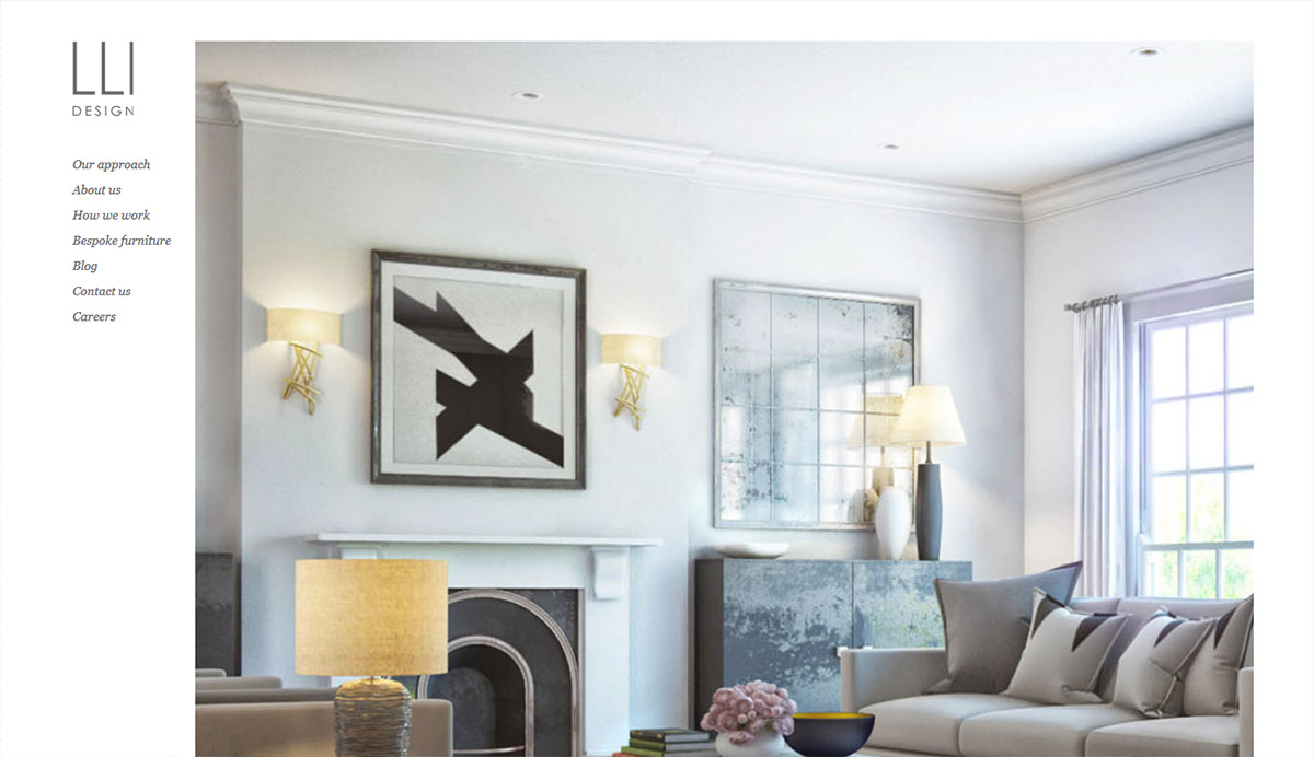
Architects and interior designers can also work a lot with images thanks to the type of work they do. "LLI design" also only uses changing images on their home page and creates a convincing and minimalistic design.

However, it must be clearly stated here that this only applies in exceptional cases. On the sub-pages there must also be a good deal of text. This applies to all websites. No web design can avoid text completely, as it is the only way to ensure that the user can appreciate the message of the website.
Shape and logo elements
If you want to be a little more quirky, logos, or even certain forms can also step into the spotlight. However, it is difficult to create a direct connection to the message. The design studio "YoungJerks" shows that it can still look very chic.

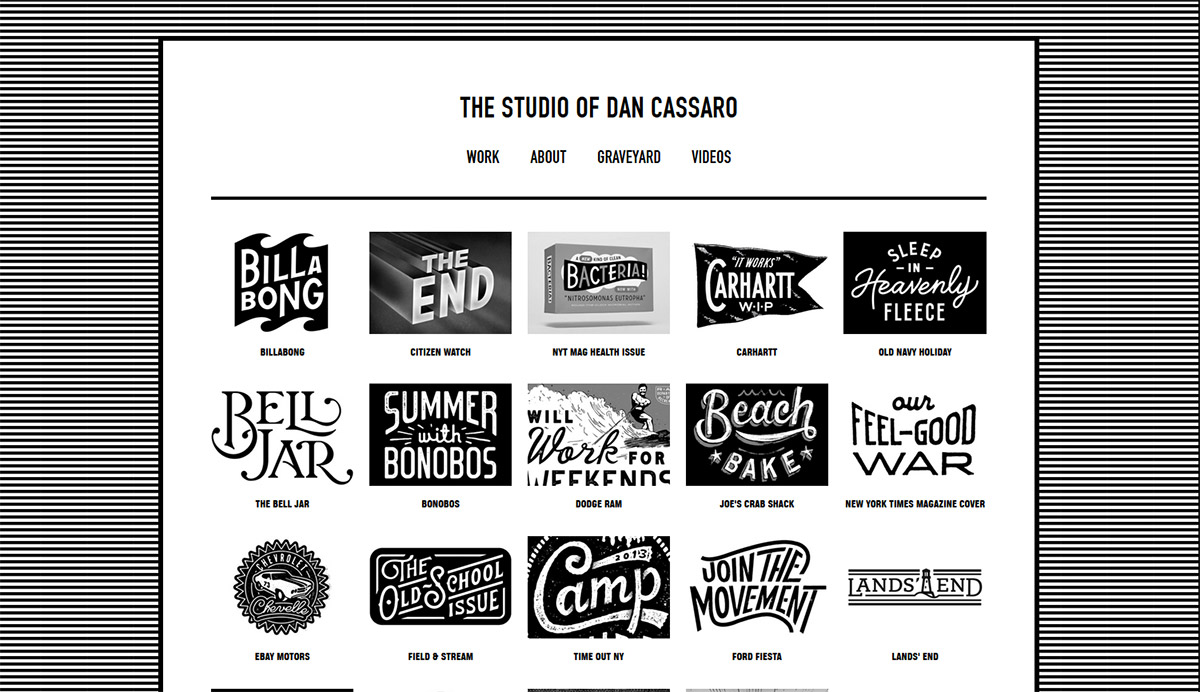
The home page of the Dan Cassaro studio impressively shows all of their customers. Since the studio has worked on the logo and typeface development of all of the logos, this is a very imaginative way of promoting their work. The entire site is kept in simple black and white to really put the logos in the limelight.
Conclusion
As we have noticed in almost all of the examples, the web design in a minimalist approach is reduced to a few items that are particularly styled and coordinated precisely with each other. The message of the website should be perfectly complemented by the selected elements and accurately conveyed to the user. The elements that can be put into the foreground here are:
- Typography
- Images
- Shape and logo elements
To be successful in minimalist web design, you must always keep a clean appearance in mind. Additional elements should rather be disregarded if they do not contribute to the side. The guiding principle of minimalist web design remains: less is more!


