Web designers agree on the relevance of typography and its impact on a web page. The content and the message are carried by the text presented. Photos and videos are merely accessories to the actual content. Therefore, the focus should be on the experience of reading a web page and its optimization. Today on the programme: Macro and micro typography in web design.
The difference between macro and micro typography
Macro typography is responsible for the adaptation of the typeface in the general layout of the web design. It is the arrangement of paragraphs, depending on the elements, such as images or colour layout. Macro typography includes, amongst other things, the margins – the distances between individual text containers – and the contrast of the font.
Micro typography takes care of the detail in the typeface. All factors that affect the font itself fall into this category. For example, the font selection and font size are microtypographic elements.
Both typography elements together form the typeface. This has a significant effect on the readability of a website. It is very important for the web design of the page. Poor readability puts an enormous strain on the eyes. The reader will feel uncomfortable and leave the website. Therefore, the primary focus should always be on the readability – aesthetics come second.
The following lines explain how macro and micro typography elements can be influenced to get the best reading experience.
Margins – spacing between text containers
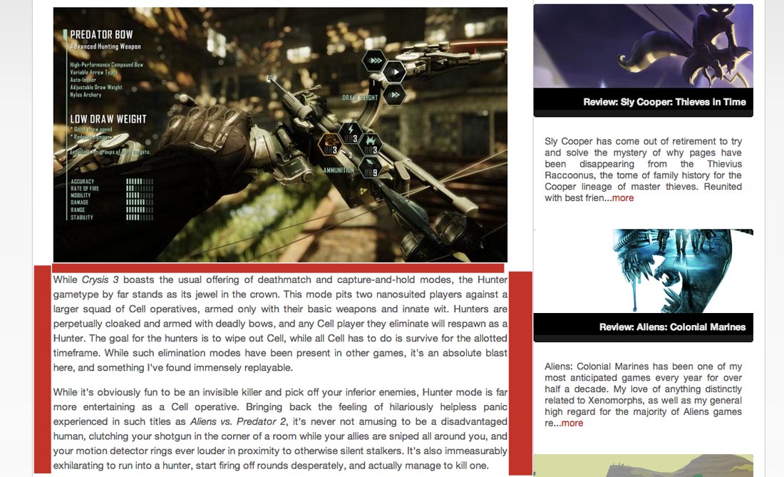
Margins are the distances from the text container to the other elements of the site. They give the eyes space to get their bearings. The distances allow the reader to distinguish the text from the other elements, allowing them to focus on the text.

Source: www.destructoid.com
The empty space created by margins gives web designers the ability to create a relationship between the text and its surroundings. The text must be embedded in the layout of the website, but remain a separate element that the reader can focus on.
Font selection
The font selection should always be made dependent on readability of the text. This is also true in web design: legibility first, aesthetics second.
Creativity and extravagance must nevertheless not be completely left out. Particularly for headings or sub-headings, fancier fonts can be selected. The main text on the other hand should be kept in a more classic and most legible form.
Contrast
The contrast should also be taken to ensure the readability of the text. The text contains the message of a page and is always the top priority – especially in web design.
The text must be readable by the selected contrast of text colour and background colour. Black on white is a classic, as there is no greater contrast of colours. However, too much of a contrast, such as black on white background is exhausting for our eyes. A suitable compromise is a dark grey on a white or light grey background.

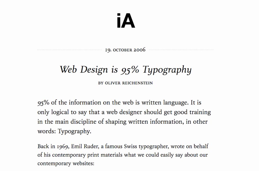
Source: informationarchitects.net
The contrast chosen by the Information Architects is adjusted in both directions. The text is a dark grey on a light grey background.
If it is to be more colourful, the same principle applies: the contrast must be right. An orange colour on a red background definitely does not deliver the best result. A dark blue on a red background has a better effect.
Font size
When the width and margins of the text container have been set, the line length can be chosen. A good guideline for a row is 8 to 12 words or 45 to 85 characters. The font size is critical to the number of characters.
The font size must ensure that the reader has a pleasant reading experience at a normal distance to the output medium. The font should be large enough that the distance to the screen does not need to be reduced and must be small enough that the reader is not too distracted during line jumps. A good average value for the font size is 16px – from there, the font size can be adjusted.
Conclusion
The key point of the article is the readability of the typeface. It ensures that the reader understands the message and the content of the website. If legibility must suffer for aesthetic means, the reader will quickly decide to leave the website.
Therefore web designers must place readability above all other things. All elements of a web page must be oriented to a large extent around the visitor having an enjoyable reading experience. Should the opposite be true, the reader will rapidly turn away from the site and towards more favourable offers.


