There are two essential basics you should be familiar with. Good web design and unique content!
The design of your website decides whether a visitor stays on the website or leaves it immediately - the content determines the rest!
Did you know, for example, that in 1/10 of a second the consciousness makes a first impression about a person? - With a website it takes only 50 milliseconds!
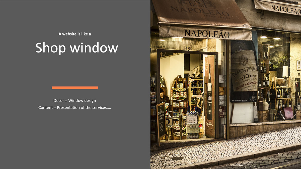
You can imagine it this way: The design and product presentation replace the shop window of a shop in the city centre. Interesting products are presented decoratively and should encourage visitors to enter the shop. In the web, decoration is the design, the products the content. Content and design thus make up a successful website.
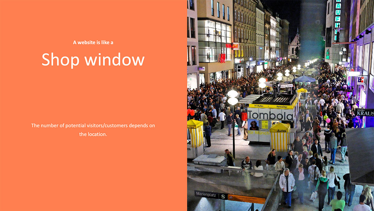
In order for a shop to be found by many people, shop owners prefer the pedestrian zones of the inner cities, on the web these are replaced by a good placement in the search engines and thus provide a lot of traffic.
Tips and tricks for a good web design
Visual hierarchy makes good web design
A good visual hierarchy is given when the visitor of your website immediately sees which are the most important contents and functions of your website and where to find them.
In this example Amazon has highlighted the button "Add to Cart" with stronger colors, because it is more important than the button "Add to Wishlist".
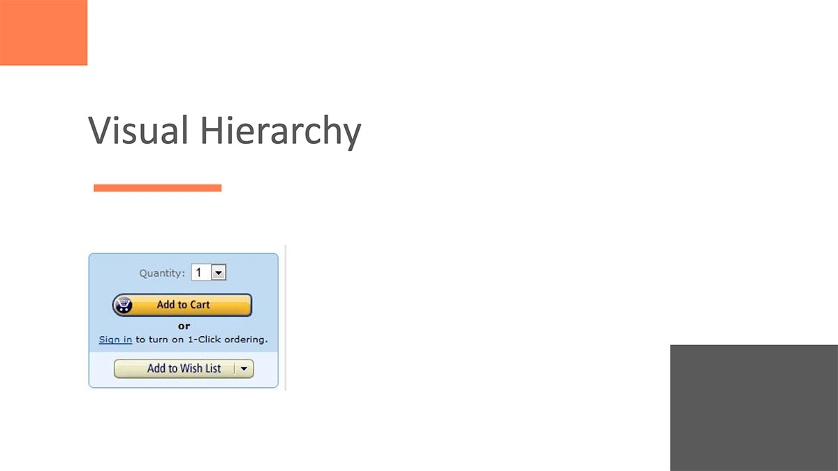
The highlighting of these contents is achieved by placement, size and color. So important contents should have an appropriate size, stand out in colour and be visible at first glance.
You therefore need to know exactly which goals you are pursuing with your website. If, for example, it is purely an information page, the most important topics should be highlighted. If, on the other hand, you offer products, the website must be prepared in such a way that visitors can quickly find the products, their details and immediately understand how they can order them.
Depending on the destination, some parts of your website are more important than others (texts, forms, shopping buttons, images, etc.), and these must attract more attention than the less important ones.
Company goals create clarity in web design
Make a list of your most important business goals. If the goal is for example profit maximization, it might be useful to highlight the products with the highest margin. If you want to increase your sales, the products that are bought most frequently should be highlighted.
Regular analysis, controlling and optimization are essential to get the most out of your website.
The Golden Number φ
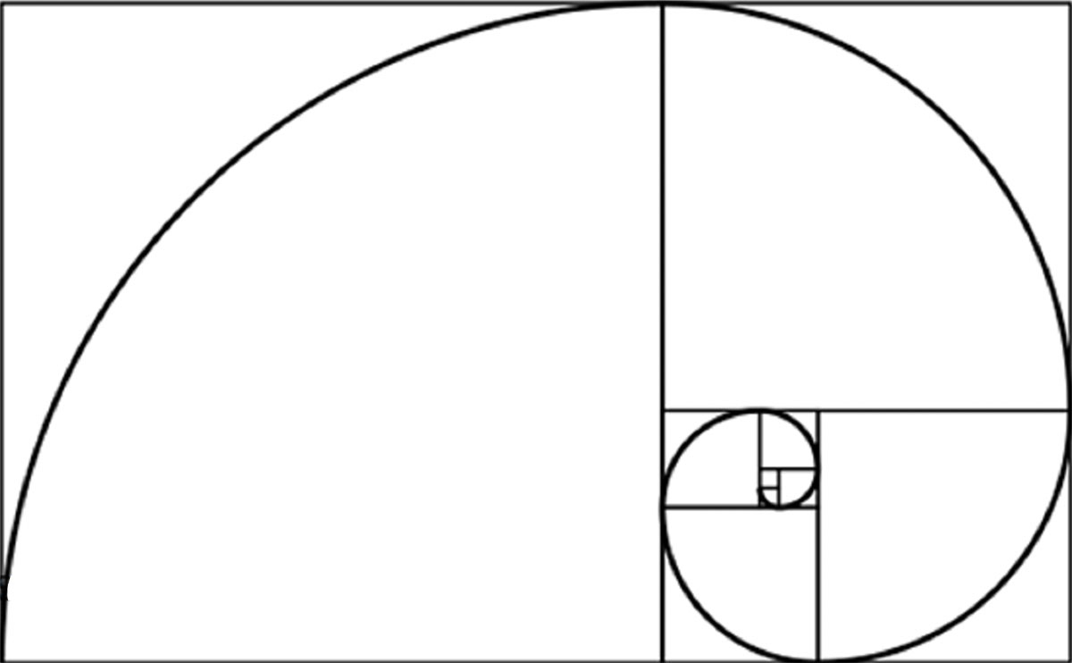
On the picture you see the illustration of the golden number φ or the divine proportions: 1,618
There is also the Fibonacci sequence, in which each term is defined as the sum of the two previous terms: 0, 1, 1, 2, 3, 5, 8, 13, 21 and so on. The interesting thing is that we have two seemingly independent subjects who produce exactly the same number.
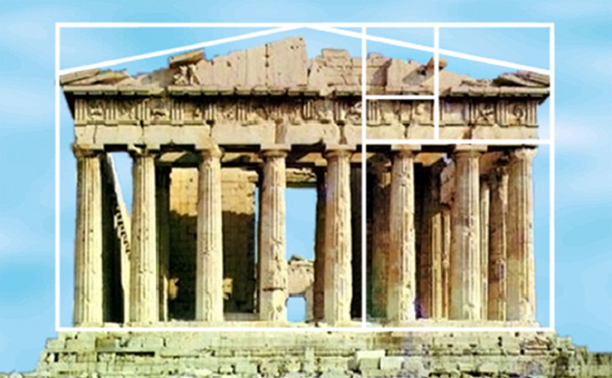
Great artists and architects have oriented their works towards the golden ratio. This is also the case, for example, with the Pantheon from Greece, which can be seen here:
However, what do these numbers or patterns have to do with web design?
Take a look at Twitter:
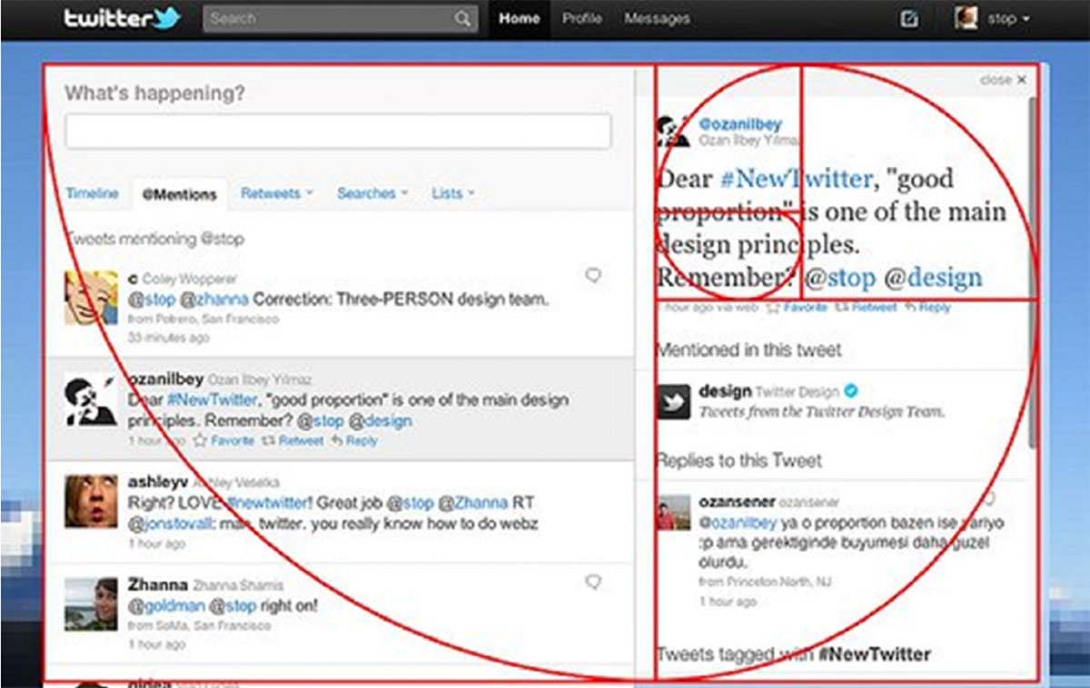
Here is a comment by the Creative Director of Twitter:
"If you're curious about #NewTwitter proportions, you know that we didn't leave these proportions to chance, but only for the slimmest version of the user interface. If your browser window is wider, the detail area will be expanded to show a larger view. This will remove the proportions. However, the narrowest width shows where we started."
Hick's law
Hick's Law, or Hick Hymans Law, is a model that describes the time it takes a user to make a decision based on the number of options available.
Each additional option increases the time it takes to make a decision.
The effect of this law can be seen in restaurants, for example. Extensive menus make it more difficult to make a decision, the selection takes longer. This is similar to the selection paradox - the more choices you give people, the easier it is for them to decide for nothing.
Just imagine that you are looking for a dishwasher. If you only have the choice between three dishwashers, you can grasp all the details in a very short time, select a dishwasher and order it. However, if you have a choice of, say, 20 dishwashers, you may postpone the purchase because the choice is very large and you are afraid of making the wrong choice if you do not deal intensively with all the machines. Whether you will then visit the same website again at a later date and make the purchase there is questionable.
Analogously, this means for your website: The more options you offer your website visitors, the more difficult it is for them to make a choice. So in order to prevent visitors from leaving your site quickly, the selection must be kept as small as possible.
So what is the consequence?
A website, that offers only three products? Unfortunately it's not that easy, after all, a large selection ensures that as many different people as possible find the product they are looking for.
The solution is to offer many products or content, but to let the visitors quickly find exactly what they are looking for.
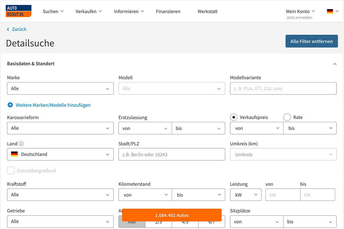
A good example of this is autoscout24.com. In many cases you don't want just any car, so you choose your desired brand and model and get, for example, a selection of 6,000 cars. I guess you don't want to look at all those 6,000 cars, do you? So you enter further details (maximum KM level, initial registration, fuel, type of transmission, price range, colour, equipment, location, etc.) and suddenly only five vehicles are displayed which meet all your criteria and the selection is much easier for you.
So if you offer a lot of products on your website, provide your visitors with the appropriate filter function!
The rule of thirds
It has been known for a long time that images and graphics make content more vivid, but how they should be structured in an optimal way is stated in the rule of thirds: An image should be divided into nine equal parts (by two equal horizontal lines and two equal vertical lines). Special design elements should be positioned on the lines or at the intersections so that the images are more balanced and attract the viewer's attention.
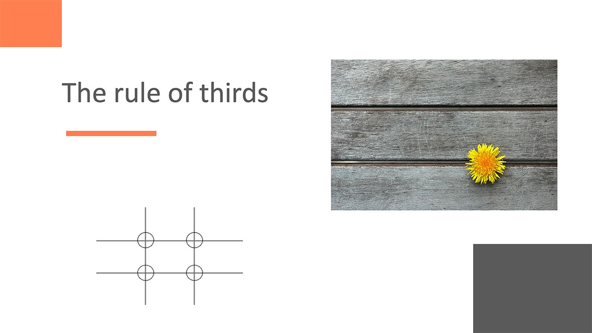
In fact, the human eye tends to follow these lines and approach their intersections rather than the center of the image. These lines are also called lines of force and their intersections are defined as the strengths of the image.
Besides the rule of thirds, there are other rules like Fitts law, Gestalt psychology, the law of symmetry and others. However, in order not to make this blog article even more extensive, we will not go into this separately here. For further reading, you can follow the links.
Ready-made web design: Templates and themes
Templates or themes are templates of ready-to-use websites. They are available on sites like Template Monster or ThemeForest. Here they can be bought at prices around 50 €.
The advantage is obvious: the web design process and the development of the browser source code for the correct display of the theme's web pages are already prefabricated.
Installation on content management systems is simple. Plugins and modules are installed for the configuration and setup of the website, which then represent the functionality.
Custom web design
Tailor-made websites have a design that is entirely handmade to the customer's specifications. These websites are unique creations that allow the client to differentiate themselves from their competitors.
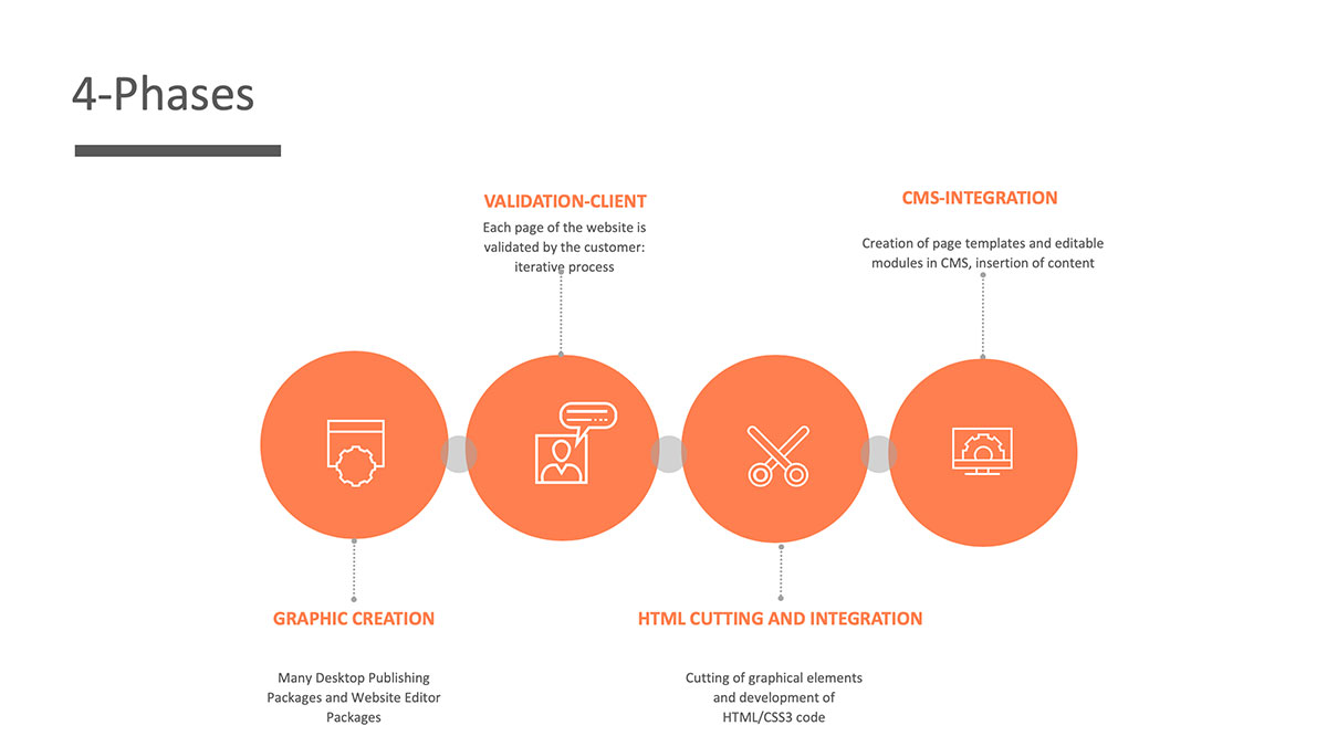
The 4 phases of custom web design
Advantages and disadvantages of templates and themes
Advantages
- LOW COSTS
Graphic design and HTML/CSS3 integration are already made
- SPEED
A website based on ready-made templates can go online quickly, the customer who chose the theme/template may be aware of the limitations.
Disadvantages
- LACK OF INDIVIDUALITY
It is very likely that many other sites have the same design. Many pages are similar.
- RIGID DESIGN
The page templates are not necessarily adapted to the content and/or business of the customer.
Advantages and disadvantages of custom design
Advantages
- HIGH EFFECTIVENESS
The website is 100% adapted to the needs of the client, both in terms of visual presentation and content communication. The presentation is original and unique. Such a presentation increases the reputation of the company through its professional and original presentation (window shopping).
- FLEXIBLE DESIGN
The design is flexible, it adapts perfectly to the content presented, as it has evolved from the content to be communicated on the website, the customer's business, the logo and the identity of the company.
Disadvantages
- COSTS
Graphic design and HTML/CSS3 integration are added to the website budget.
- SPEED
An individual website needs more time, because the creative phase is an iterative process in the sense that each design must be validated by the customer or is subject to change.
Content is the King of SEO
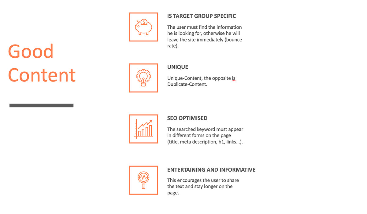
Unique, high-quality content is nowadays essential for good ranking in search engines like Google.
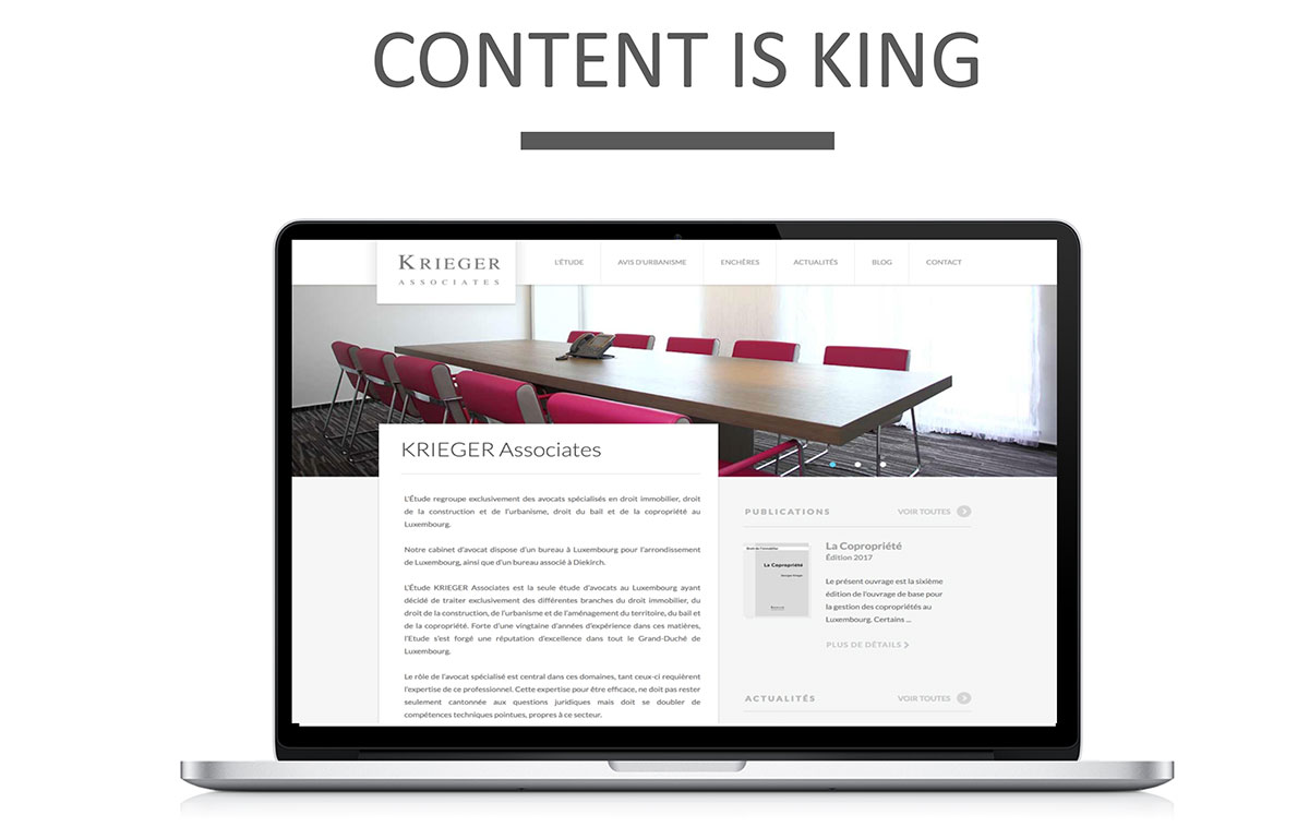
While in the early days of the Internet simple pages filled with keywords could achieve good positioning, Google has with new updates such as Panda, Penguin and Hummingbird ensured that high quality texts are better rated.
“Google does not use the keywords meta in web” - Matt Cutts (Google Evangelist)
Google-Hummingbird
One of Hummingbird's main objectives was to translate the concept of semantic research into reality - in the hope that it would eventually become the norm in research.
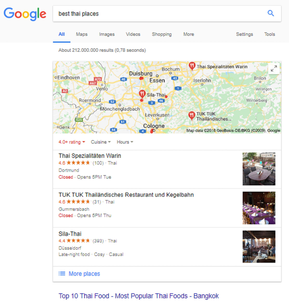
In the example, a number of restaurants are offered to the user rather than sites in Thailand.
Good Content for a better Ranking
The foundation of the relevant contents are quality texts.
A good text for the web meets a number of criteria. For search engines like Google, unique content is one of the most important factors in the ranking.
Unique Content vs. Duplicate Content:
The opposite of Unique Content is Duplicate Content. Duplicate content is identical content that is published unchanged on more than one website. This means that Google will only rank the site with the highest authority (e.g. the longest lasting source or the site with the most visitors). Domains with identical content, on the other hand, are referred to the rear places or even completely removed from the index. Only websites with unique content are therefore found well in the search result lists.
The background is that Google only wants to make each content available to its users once. Because only if a website offers new and relevant content to the searcher does he stay longer on the site and spread its content on the net with a higher probability!
At a glance:
Tips for high quality websites
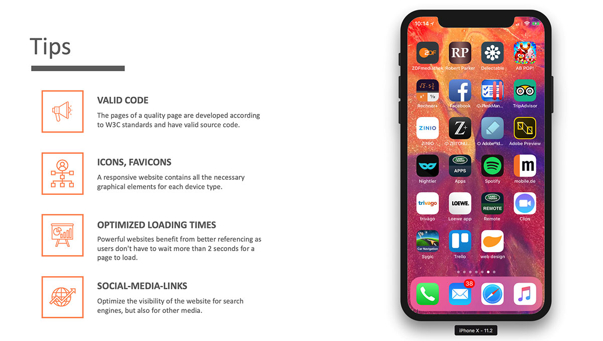
And finally a few tips
Ranking
Free ranking
The use of the company profile in social media such as Google Business, Facebook, LinkedIn, etc. increases visibility and at the same time increases the level of awareness of the company through its presence. With the use of social media you have a free opportunity to improve your ranking.
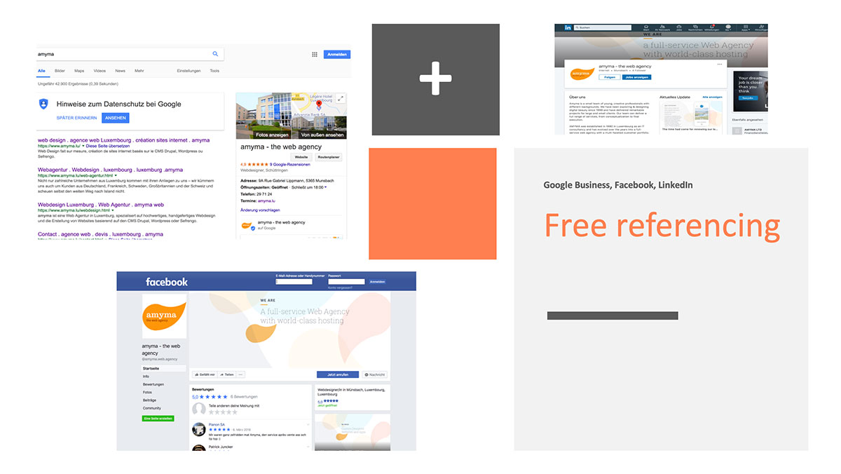
A business listing also offers the opportunity to collect reviews, if you have many positive reviews, so that also affects the ranking of your site positively.
Same applies to Facebook!
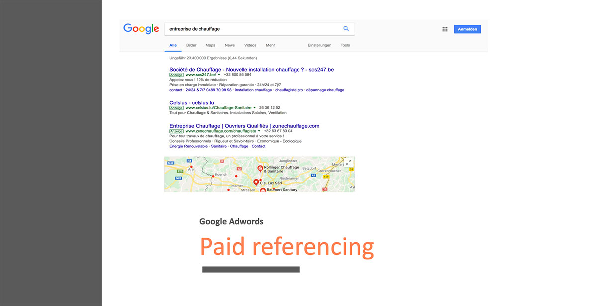
Paid ranking through Google Adwords
In an environment with a lot of competition it is difficult to be well listed for all desired keywords. In these cases, paid ranking can be very useful.
The bottom line
Think about what you want to achieve with your website, optimize the design accordingly and regularly provide high-quality, unique content. Use social media and Google Adwords, if applicable, as well as meaningful title and description tags for each subpage.


