The Windows logo has changed a lot over the course of the Internet era – like many of its comrades. The logo of Microsoft's operating system has become increasingly simple – almost minimalist. There is a similar trend in web design: The complete design must impress through simple features. Today, we turn our attention to a very special branch of minimalist web design: flat design.

Not only the logo of Windows 8, but rather the complete user interface is kept simple. This trend was inspired by the tile system of Windows phones and Microsoft’s own tablet, the Surface. The flat trend has now been incorporated on the net and has taken its place on many hand-designed web pages. Before we look at more beautiful, flat web examples, we will first explain the trend in a little more detail.
Flat web design in detail
In contrast to previous trends in web design, all elements in flat design are minimalistic: the logo, the buttons, the font and even the content containers have a flat design. Therefore, most web designers use rectangular shapes similar to the tiles in Windows 8.
In addition to the tiles, it is important to see what the flat design leaves out. Web designers avoid skeuomorphic and 3D-like objects. Skeuomorphic elements were popular especially in Apple's glory days. Many apps were then designed so that they remind us of everyday things. The Notepad app had a paper-like design, which was modelled on a notepad. The flat design dispenses with such gimmicks. Simplicity is at the forefront. This is shown very well in the following examples.
Tiles in flat web design
As already mentioned several times, tiles are one of the main components of flat web design. In our examples below, you can see how diversely they can be employed by a good web designer.

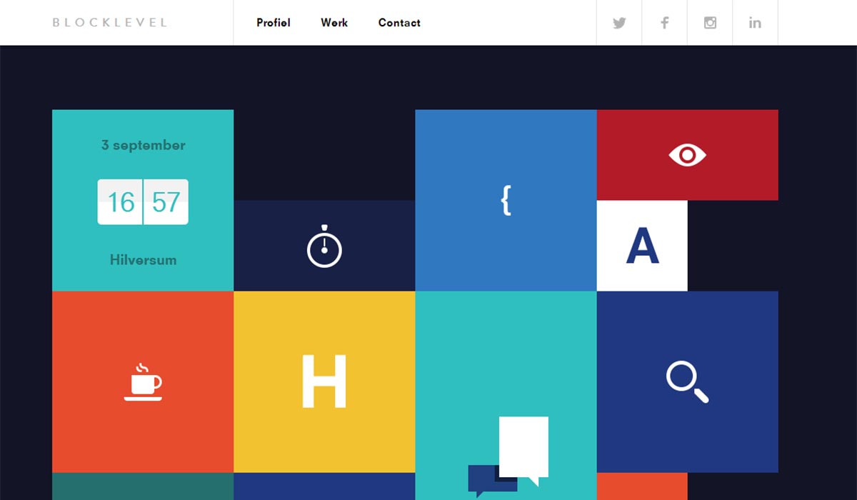
The Dutch digital production company Block Level used a very rectangular design for its website, which many will already know from Windows 8. The unique thing about the web design is the fact that each tile is animated. Thus, the simple signs transform into different information about the agency. This includes useful information or even how many cups of coffee are currently in their dishwasher – a nice and effective web design that runs through the entire website. This means that it is not the design in the foreground, but rather the content. This is of course still beautifully put in the limelight by the flat web design.
Logos and symbols
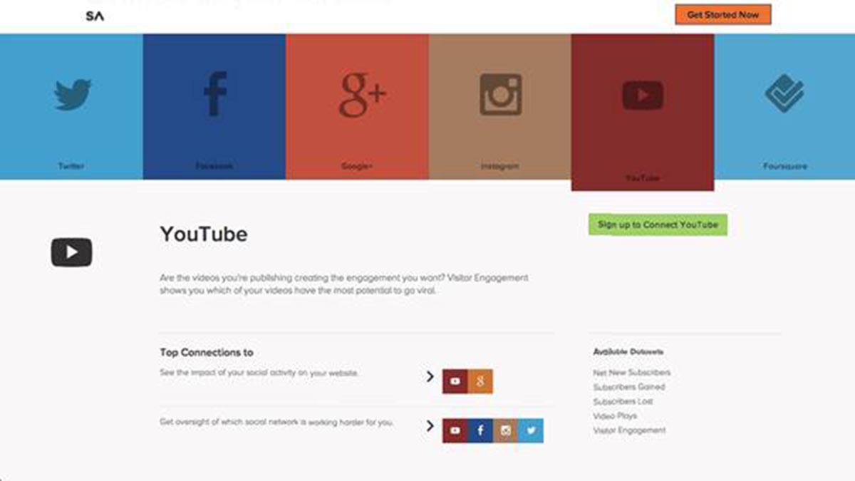
Tiles can also affect other things such as logos and symbols. In the case of the web service SumAll, the symbols are reduced to tiles.

The logos of several services, such as Facebook, YouTube, Twitter and many more were taken and packed in a tile of the matching colour. This results in a manageable and at the same time compact web design, which the user will get used to quickly. For this purpose, each tile can be expanded. Thus all of the necessary information can be optimally compressed and presented to the user to match the web design.
Tiles as an information container
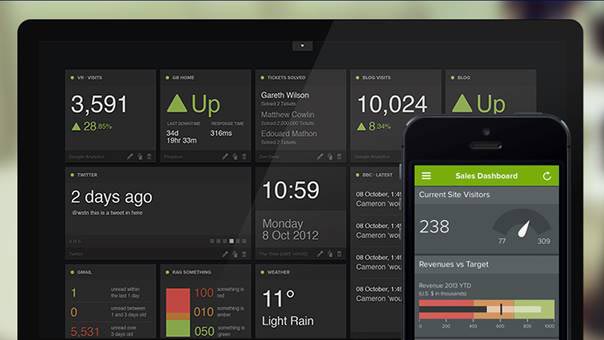
However, tiles can not only be given an appealing design, they also use space very efficiently. The advantage of rectangular shapes is that the web designer can put them together like little puzzle pieces. The perfect example is the app Geckoboard.

Geckoboard shows all of the user's data in one window. The app gives the user a fantastic overview and also a nice list of all his or her relevant data, marked with the matching colour characteristics. In this way, the user can more easily filter to the important facts.
Conclusion
There is a key principle for flat web design: the simpler the better. It is also easy to see from examples why this is so: web design puts the contents in the foreground by using flat and sets the scene for them perfectly, despite the minimalist implementation. To that end, the tiles can be perfectly lined up, giving the web design a tidy look while offering the visitor a good overview. Of course, it needs the skilled hands of a web designer to give the website its own character.


