There's a lot to think about when designing a website. It's not just about creating something that looks good but also ensuring that it does what it sets out to do — in most cases, marketing products or services while inspiring readers to take action. Visual hierarchy is central to this, but what is it, and what do you need to know? In this post, we'll be answering these questions and sharing the key elements of visual hierarchy when building websites.

What is visual hierarchy, and why does it matter?
Unless you work in design, you might not have heard the term visual hierarchy before. Essentially, it refers to the way people process information when they're looking at a page. Using knowledge about visual processing, designers can apply several principles of visual hierarchy to organise content on the page to get better results.
This concept is vital when it comes to maximising the effectiveness of your website. If elements of visual hierarchy aren’t leveraged in your design, it’s likely that your audience will miss some vital information — reducing the likelihood they will go on to do what you want them to (e.g. contact you, make a purchase or sign up for your newsletter).
The importance of visual reading patterns and eye movement
Visual hierarchy is based on what psychology tells us about how people perceive and process information. When we read something, either online or in print, we tend to use a distinct set of reading patterns. Studies tracking an individual's eye movements consistently demonstrate these patterns. When browsing websites, our visual reading patterns usually fall into one of two categories:
F patterns
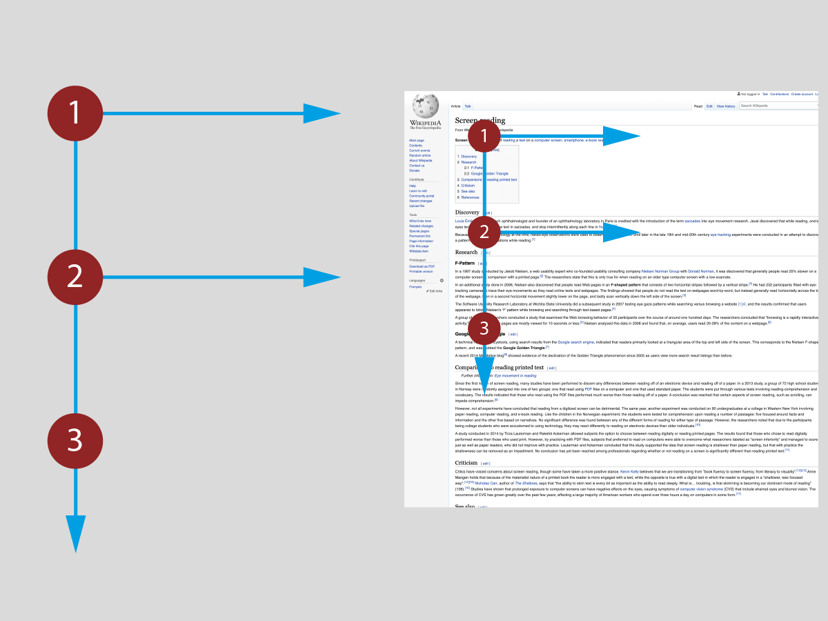
People tend to read using an 'F' pattern when looking at a page with a large amount of text, such as a blog post or other web pages with lots of writing. We scan across the top of the page, moving from left to right, before moving down the page's left-hand side and checking for other important pieces of text. We repeat this pattern until we've finished on the page.
Z patterns
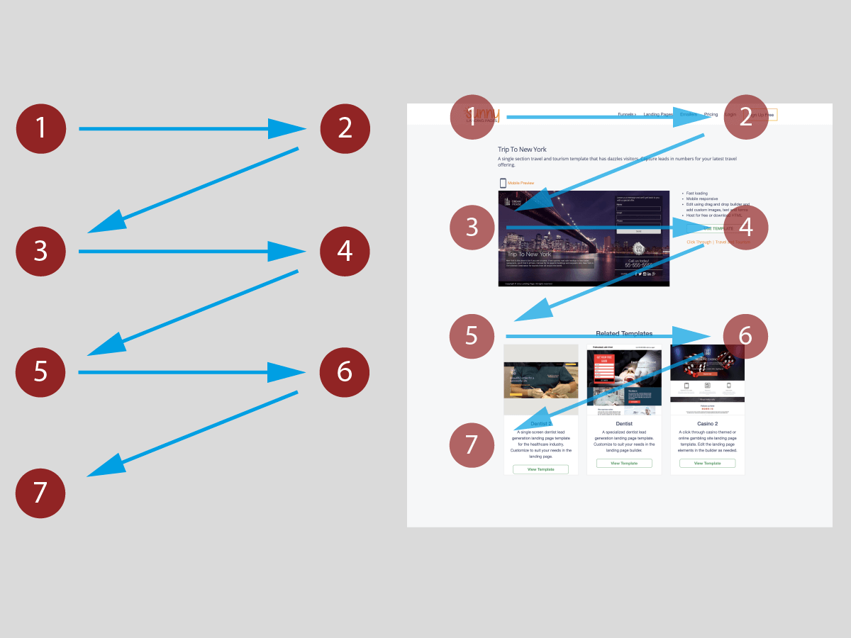
With web pages with less text or text that's broken up with large images or space, such as home pages or sales pages, we tend to process them using a 'Z' pattern. Like the 'F' pattern, this begins with the user reading across the top, from left to right. But, instead of looking back down the left-hand side of the page, the reader instead moves their eyes diagonally across the page before repeating the pattern.
How do these patterns help us design websites?
When we understand how people process websites, we can structure the content for maximum impact. For example, using the relevant pattern ensures that the most important content is positioned to make the most of our natural reading styles.
These findings underpin design theories based on visual hierarchy, which can be influenced by a wide variety of factors. Let’s look at 10 of these design elements in more detail:
1. How we use colour in your design
Colour is an essential part of any design process. It helps us convey your brand's identity to the end-user. Colour theory sets out how different colour combinations interact with each other to deliver your message and tell a story. It also helps create hierarchy and structure, guiding the user's attention to your web design's most important aspects.
There are many ways to do this, and the right approach will depend on the type of energy you want to create with your design. However, we typically use the following principles to guide our design process:
Create harmony with colour temperatures
Colours can either be warm (e.g. red and orange), cool (e.g. blue and green), or neutral (e.g. black and white). Grouping together colours with similar temperatures creates a more harmonious design, which helps to direct attention.

Less is more
It's also essential to use the right amount of colour. Too much colour or inappropriate colour combinations can distract attention from the core content and overwhelm users. It's a delicate balance and something we place a lot of emphasis on throughout the design process.
Use contrast strategically
One of the reasons for creating a cohesive, harmonious colour palette is that it enables us to make the most of contrast. Ideally, contrasting colours should direct attention to the most critical areas of your page, like a call-to-action button encouraging the reader to add a product to their cart or subscribe to a mailing list.

2. Using scale in your design hierarchy
The scale of a design element is its size in relationship to the other elements on your page. Finding the right scale for the essential elements of the page is crucial, but it's also one of the most challenging parts of the design process.

This step is all about making sure each element of the design works well with everything around it. When it's done right, it gives balance to the design and helps the reader's brain figure out where to focus their attention, ensuring they take in precisely what you want them to. The most important elements should be the most visible.
3. How do we use shapes in design hierarchy?
Good website design isn't just about images and text. It should also incorporate shapes to add visual interest and colour, and strengthen your copy. Sometimes, shapes are just as crucial as words when conveying a message, especially when you want to reinforce a particular emotion. For example, the heart shape is intrinsically linked to feelings associated with love.
Shapes and symbols are also a great way to direct attention. For instance, we can use arrows to guide the user to important elements of the design. We can also use shapes to divide one part of the page from another, breaking up chunks of text to make your content easier to process.
4. Empty space is a vital tool to create a design hierarchy
Have you ever visited a website and felt like you couldn't make sense of what was going on? Many people make the mistake of including too much content on their page without giving the user space to process it.

It's not that there's necessarily anything wrong with pages that have a lot of content. But if you're expecting the user to take that content in, you need to break it up with some negative space.
This reduces the reader's effort to process your content and helps essential elements stand out and get noticed. We should have pauses in our design in the same way we'd have lulls in our real-life conversations.
5. Giving your hierarchy order using alignment
Traditionally, text on western websites is left-aligned. This is often the best option, particularly for large chunks of text, and can again help create order and balance to the overall design.

While consistent alignment helps direct the reader's gaze down the page, breaking the rules to align some design components centrally or to the right can help essential elements stand out. For example, changing the alignment can help draw attention to an illustrative quote (e.g. a review or testimonial) or links to your products or services.
6. How repetition impacts design hierarchy
Good design doesn't reinvent the wheel on each page. In fact, repetition is central to creating cohesive marketing materials that your audience consistently identifies as your brand.
This principle applies to each page of your website, too — repetition of brand assets throughout your design helps set out the visual hierarchy and guide the user. Elements that can be repeated include your colour palette, brand patterns, symbols, and fonts. It would help if you also used photographs and illustrations with a similar theme or look, bringing the design together.

Our clients sometimes worry that too much repetition will come across as monotonous and lacking in personality. In reality, the opposite is true. Repeating key aspects of your design strengthens your brand's personality, ensuring your audience gets a feel for your brand's personality and what it stands for.
7. What is proximity and how does it influence design hierarchy?
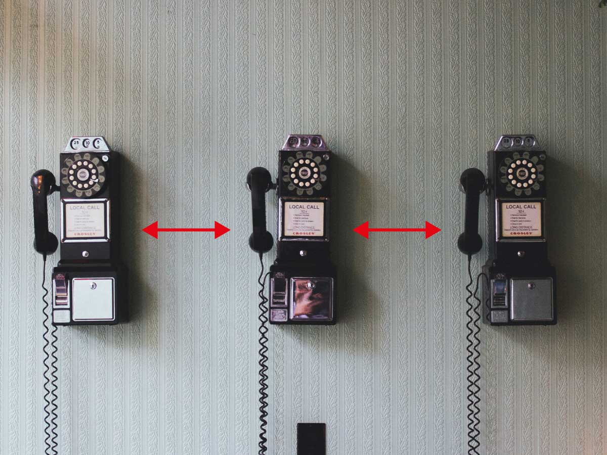
Proximity is another component of the visual hierarchy we consider for each design. When you place objects close together, the reader will perceive them as a group.
Like with most of the principles we've spoken about, this is all about balance. There's no such thing as "good proximity" or "bad proximity" — it's about the placement of your web page's different elements to facilitate your reader's understanding and engage their interest. Placing objects too far apart will make your page feel disconnected. Placing them too close together will confuse the flow of content and make it hard to read.
The best approach is to place related items closer together and leave space between one group of items and the next. Striking the right balance gives your website structure, with the visual hierarchy obvious to anyone who visits the page.
8. Your font choices shape your visual hierarchy
The way you present the texts on your website is fundamental to the visual hierarchy, influencing how readers interpret your design.
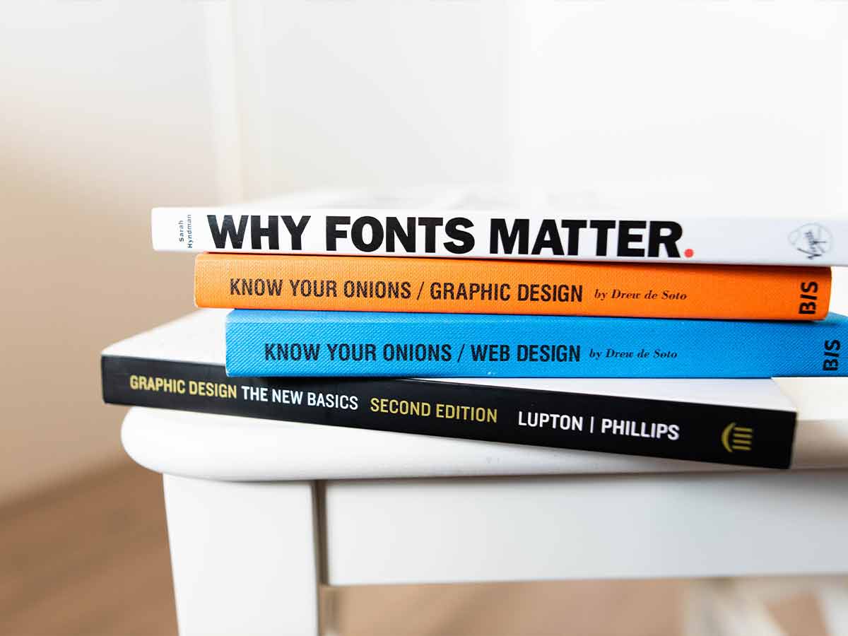
The most basic principle here is that all text must be readable. If it's too small, doesn't contrast well against the background, or is written in a hard-to-read font, your readers will lose focus. When this happens, your efforts to provide visual hierarchy are diminished because the reading flow (the patterns we talked about above) has been disrupted.
You can also use fonts strategically to draw attention to different parts of the design. For example, you may choose a different font for your headings to make them stand out, or you could change the colour to indicate urgency or draw attention to a call-to-action. You can also make less important text smaller. You can make use of the underline, italicise and bold functions to make certain parts of your text stand out.
When you find something that works, it’s important to repeat it consistently across your website to create a cohesive brand style.
9. How to compose your design to make sure people read your words
Most people understand the value of words when they want to sell something. Your web copy is crucial to ensure people understand your product or service, especially the benefits it provides.
But here's something many people don't know: fewer people will read your web copy if your design isn't put together well. In other words, if you want people to read your words, you need to think about your composition.
In the design world, we talk a lot about leading lines. These aren't necessarily actual lines — they are a technique we use to create a sense of movement that draws the reader's attention to what we want them to see.
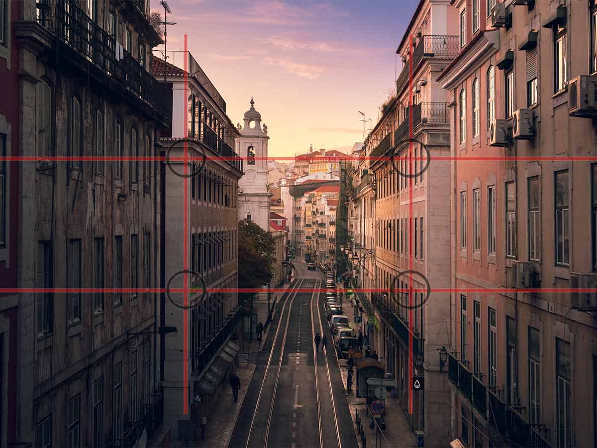
The rule of thirds is another technique that helps balance the composition of the design for the best results. This involves planning your design using a grid format, placing important elements at the intersections to create interesting and engaging visuals.
10. Use motion to bring your design to life
As technology evolves, it's becoming easier to create fun, engaging, and interactive designs to catch your audience's attention. Adding movement to your design is one way to do this, and it can really bring your design to life. You can add movement using video or animation, or even by using techniques that bring static images to life, such as parallax scrolling. It should be used sparingly, however — the goal isn't to overwhelm the reader, but to draw attention to the most important parts of your website.

Conclusion :
To conclude, the principles of visual hierarchy are grounded in human psychology. It's science. The way we take in information is well-established, with particular reading styles associated with different content types. It's crucial to consider this when designing a website and maximising the impact of the end result.
When we're strategic about the visual hierarchy of a design, it means we can influence how potential customers process the information they’re given. It means your audience will typically read your content as intended, increasing the chance they will take action. After all, that’s the purpose of your website — to engage your audience and persuade them to buy your products and services. Visual hierarchy can help you achieve this.


